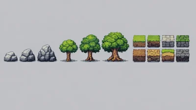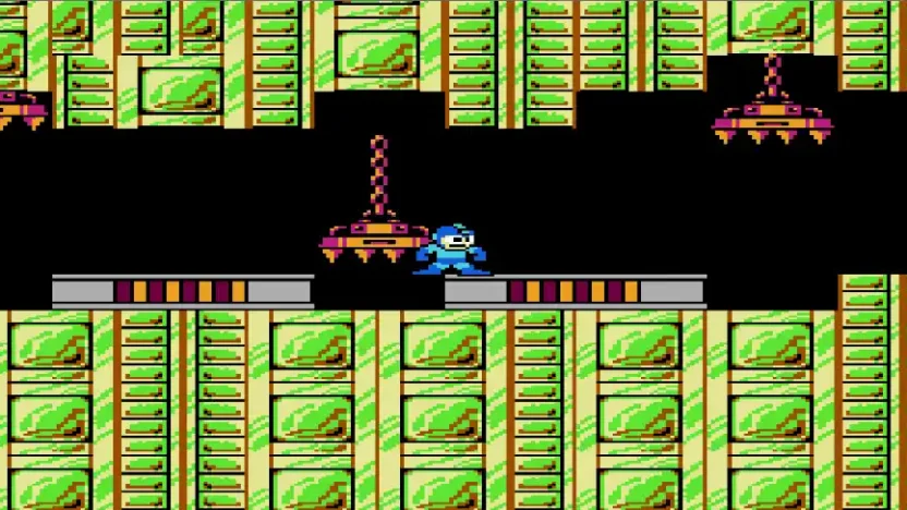
Gameplay is not about standing still and admiring visuals
During gameplay, players rarely stand still. The screen changes constantly as the character moves and the camera follows. Even in slower-paced games, the visual space is always shifting, and the player’s eyes are continuously processing information.
In this context, pixel art is not something the player stops to admire. It is something they read almost automatically while focusing on movement and interaction. An image that looks fine on its own can behave very differently once it is placed inside a moving game screen. The longer a game is played, the more noticeable this difference becomes.
Readability is what I notice first
When playing a game, the first thing I notice is not how beautiful it looks, but whether I have to strain my eyes. At a glance, can I immediately recognize the player character. Can I tell what elements matter for gameplay and what belongs to the background.
Pixel art starts to feel problematic when I have to slow down just to understand what I am seeing. Not because it looks bad, but because it interrupts the natural flow of play. Being slowed down by visual confusion often feels more frustrating than being challenged by the game itself.
Screens that are easy to read rarely draw attention to themselves. I usually only notice how comfortable they are after some time has passed, when I no longer have to think about looking at all.
When repetition starts to speak
A lot of pixel art looks fine when it appears only once. In games, however, repetition is almost unavoidable. An asset is often created once and reused throughout the entire experience. Because of this, repetition becomes a very honest test for pixel art.
Small details that seem harmless at first can gradually become tiring if they constantly pull visual attention every time they appear. Not because they are ugly, but because they repeatedly demand to be noticed. After playing for a while, these elements begin to “speak” in a way that is hard to ignore.
There are assets that feel completely fine at the beginning of a game, but slowly make the screen feel heavier and more cluttered over time, even though the gameplay itself has not changed. In those moments, the issue is not level design, but pixel art that does not hold up well under repetition.
Pixel art that remains comfortable over long play sessions usually knows how to keep its role. It is clear enough to support gameplay, but quiet enough not to constantly compete for attention.
Scale and screen space matter more than I expect
Another thing I often notice is how much screen space pixel art occupies. Some assets feel impressive because they are large, high contrast, or heavily detailed. During gameplay, that visual dominance can quickly turn into a burden.
When too many elements try to stand out at the same time, the screen starts to feel heavy. The player character no longer feels like the natural center of attention and has to compete with backgrounds and decoration. Even in slower games, this feeling still appears, only more gradually.
Pixel art that works well for gameplay, at least from my perspective, rarely tries to impress. It knows when to step back and allow movement and player actions to remain the focus.
Pixel art does not exist without context
I used to evaluate pixel art as if it existed on its own. Over time, that way of thinking proved unhelpful. The same asset can feel perfectly right in one game and completely wrong in another.
A background that creates atmosphere in one situation may become distracting in a different one. A decorative element that works fine in a single screen can feel exhausting when stretched across an entire game. Pixel art is always shaped by pacing, layout, and how players interact with space.
For me, pixel art only becomes meaningful once it is placed within the context it is meant to serve.
I do not use a checklist when evaluating pixel art
I do not run pixel art through a fixed list of criteria. Instead, I pay attention to how it feels while playing. If I start to feel visual fatigue, mild confusion, or notice my eyes being pulled toward unnecessary details, that usually signals a problem.
These reactions are not always immediate. Sometimes it takes time, or even multiple play sessions, before the cause becomes clear. But once those patterns are recognized, they are difficult to unsee.
Visual judgment develops slowly
Evaluating pixel art for gameplay is not a skill learned quickly. It develops gradually through playing many games and noticing the same visual issues appear again and again. Playing with a slightly more observant mindset teaches far more than any written guideline.
Retro Pixel Art exists to support that process. Not by telling anyone what to do, but by giving shape to familiar observations and making recurring patterns easier to recognize. When those patterns become familiar, evaluation feels less like analysis and more like instinct.